
Can people read it?
Every planThe designer warns about text too small for the TV, low contrast and blurry photos.
While you design, Dislab checks the sign against the TVs that show it. It’s advice only; the sign still saves.
- A layer that may be hard to read gets an amber mark in Layers. Select it to see why at the top of its settings, under Hard to read?
- Under the sign, a line says how many parts may be hard to read, and from how far on what size of TV.
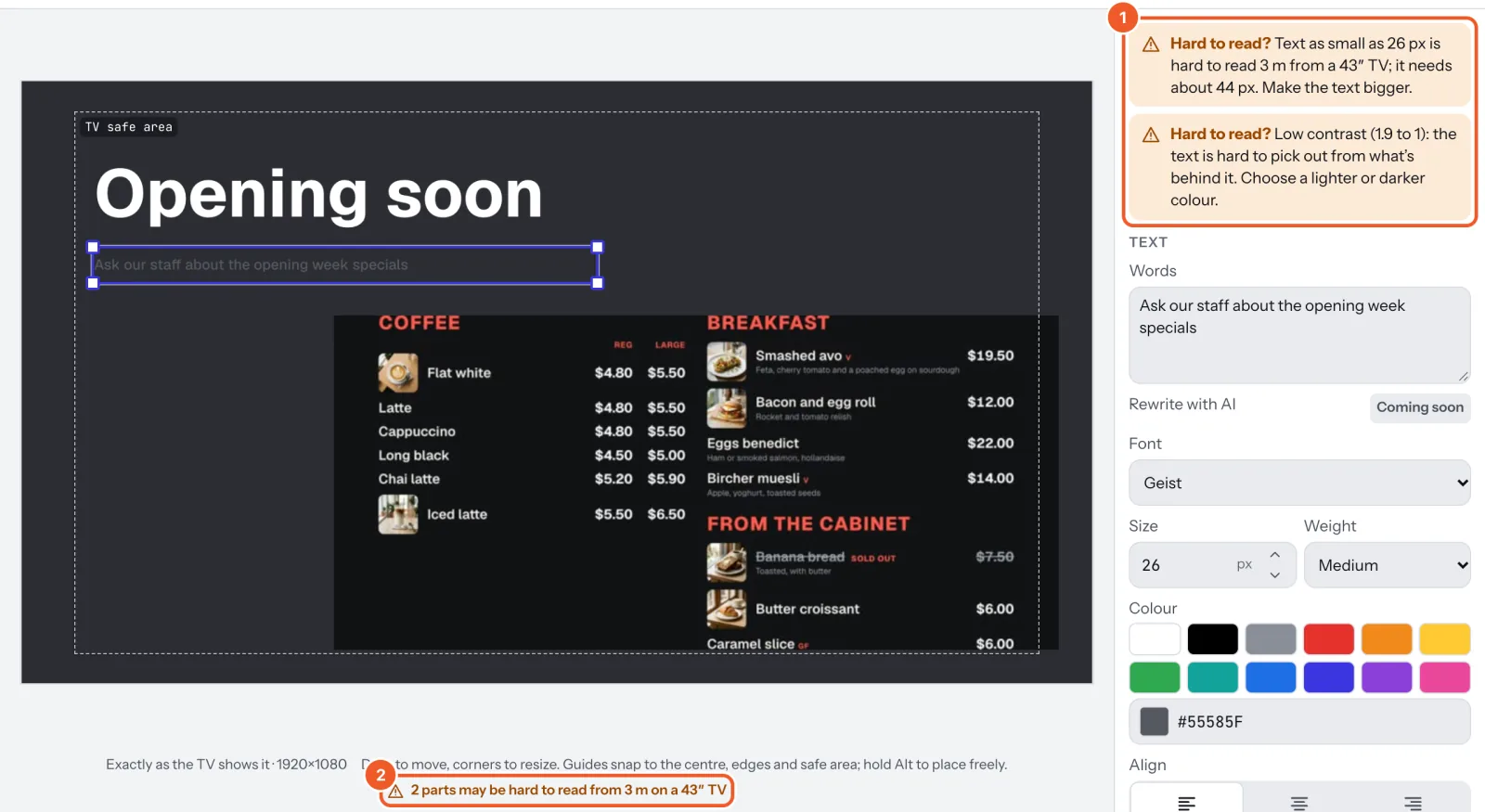
- Too small: letters need to be about 1.5 cm tall to read from 3 metres. Make the text bigger, or the widget’s box bigger.
- Low contrast: the words are too close in colour to what’s behind them. Choose a lighter or darker colour.
- Soft photo: a photo shown more than one and a half times bigger than it was taken. Use a larger photo or a smaller box.
Set each screen’s TV size and viewing distance on its page (screen settings); with none set, Dislab assumes a 43″ TV seen from 3 metres. A sign is checked against the hardest screen showing it.
Thanks for telling us. If something’s missing, tell us what and we’ll add it.
Still stuck?
Email support@dislab.app, or send us a message. If it’s about a screen, tell us its name. We answer within one business day.